How to edit image text and match the original font style
Match the visible letter shapes, spacing, color, and effects when replacing text in a poster, label, or finished graphic.

Pick a nearby reference
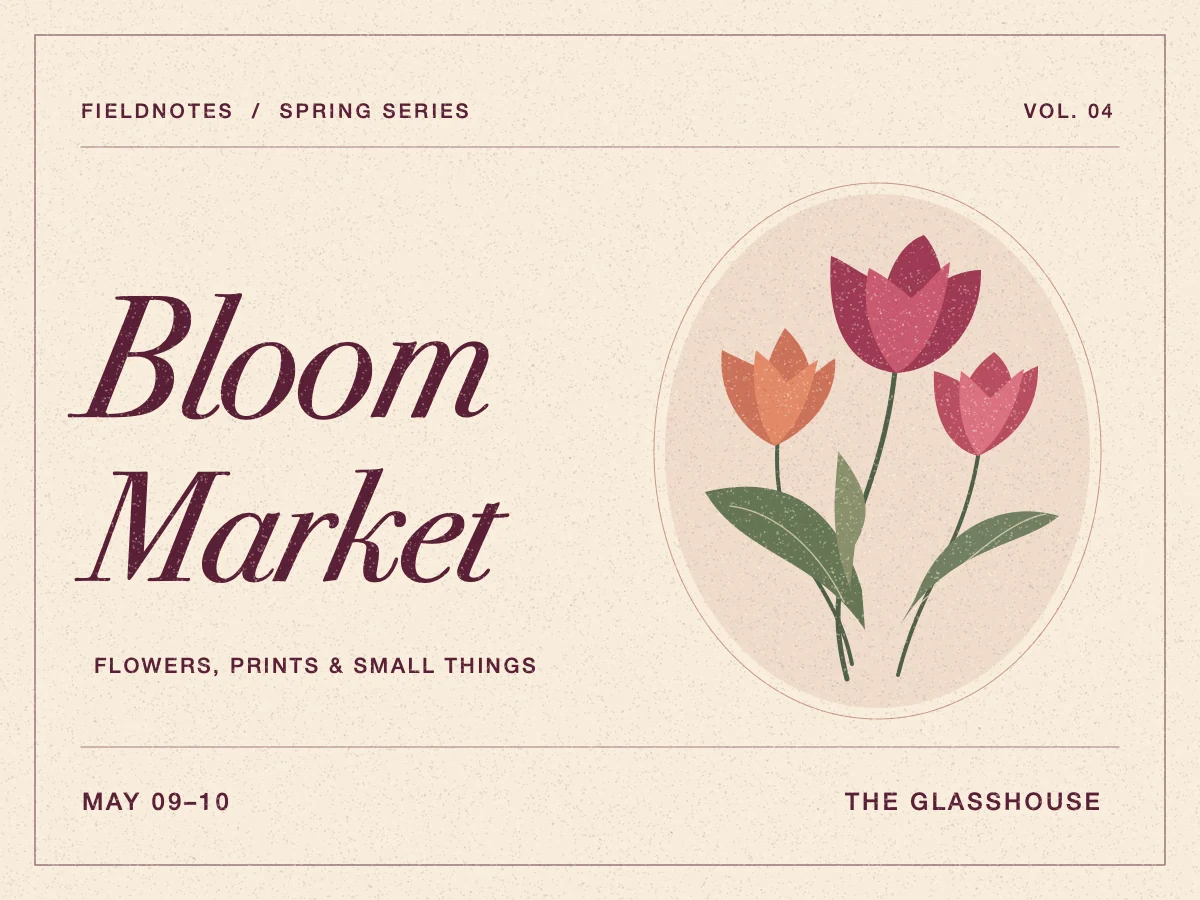
The flower market poster uses Bodoni 72 Book Italic, a serif with bold downstrokes and fine hairlines. Replace Bloom with Blush and use the untouched Market as a reference for the slant, color, and stroke contrast.
Select the word and give the new letters room
Choose Try this example to load the original poster, the box around Bloom, and the replacement Blush. Keep the entire word and its fine serifs inside the box, with a little extra room on the right.
Check height, baseline, spacing, and finish
After generating, compare the top and bottom of the new letters with the untouched ones on the same line. Look for thinner strokes, uneven gaps, or a shadow that falls in a different direction. On angled signs, check that the new letters follow the same slant. Zoom back out to check whether the whole line reads as one piece.
Use the source font for an exact match
A close visual match is enough for many one-off graphics. If a brand guideline specifies an exact typeface, or if the same design will be updated often, use the original design and its licensed font to keep the text editable. If all you have is the exported image, ask for the source or confirm the font before rebuilding the line.